
indigo: brand evolution
welcome to indigo 2.0! this journal entry is a guest entry from the creative behind our rebrand, samantha wills.
Samantha is a multi-disciplinary creative powerhouse – an author, designer, founder, and what we affectionately term a 'brand scientist.' Known for founding one of Australia's most renowned accessories brands, she has also penned the best-selling memoir 'of gold & dust,' chronicling the intricacies and challenges of building a creative business and the journey of a female founder. Beyond her design work, Samantha is a dedicated creative educator, having developed a comprehensive curriculum for creative entrepreneurs through the Samantha Wills Institute.
With an innate understanding of both business and branding, Samantha was the perfect choice to spearhead our creative rebrand.
In this journal entry, Samantha offers a mini masterclass, providing a detailed look into our rebranding process. She delves into how she transformed our three core objectives into the enchanting and dreamy world of Indigo.
You can learn more about Samantha and her work at samanthawills.com and on her socials:
By Samantha Wills————
when carolyn and sarah approached me about undertaking the brand work for indigo wellness group, their objectives were:
i.to evolve the brand——
As most owner-operated businesses do, it begins by being so reliant on the founder(s), the business operation, and branding is by osmosis anchored to and built around the founders. In Indigo's case, the story was of two sisters—a family startup. But just like seasons transition, so too must brands. And Carolyn and Sarah were keen to honor their origins but move the brand into its next evolution.
ii.a feeling of cosy and calm——
The physical Indigo clinics have a feeling of exhale and decompression when you walk into them, their dark indigo walls envelop and nurture the nervous system. This was an element that they wanted to convey through their digital footprint also.
iii.fresh and holistic——
The third objective was to find a modern and clean approach to showcase the holistic services on offer. Not too minimal but not busy, finding a balance of beauty and also breathing room.
Below, I'll walk you through the strategy for each objective. But crucially, before moving from concept to execution, defining the evolving tone of voice for the brand was paramount. Much like core brand values, this tone of voice serves as a compass, ensuring that words, imagery, layout, palette, and overall identity not only resonate with each other but also effectively communicate with the Indigo audience.
Presented here is the foundational tone (figure 0.i———tone of voice) I shared with Sarah and Carolyn, forming the basis of our creative direction as we embarked on the next iteration of the brand
tone of voice
“Indigo's tone of voice is soothing and nurturing, creating a sense of calm and reassurance in every interaction.
We speak with a demystifying clarity, making holistic health accessible and understandable to all.
Our communications are insightful, providing deep and meaningful guidance that enlightens and informs.
In every message, we maintain a grounded approach, ensuring our advice is practical and relatable.
This harmonious blend of empathy, clarity, and grounded wisdom invites a sense of trust and ease, making everyone feel supported and understood on their journey to wellness.”

figure 0.i———tone of voice
words as visuals
In my creative process, I place significant emphasis on using words as visuals. Words are inherently powerful, brimming with beauty and imagery. My approach often begins with words, weaving them into the design. One key practice I employ is the blending of masculine and feminine elements. But how does this translate into design?
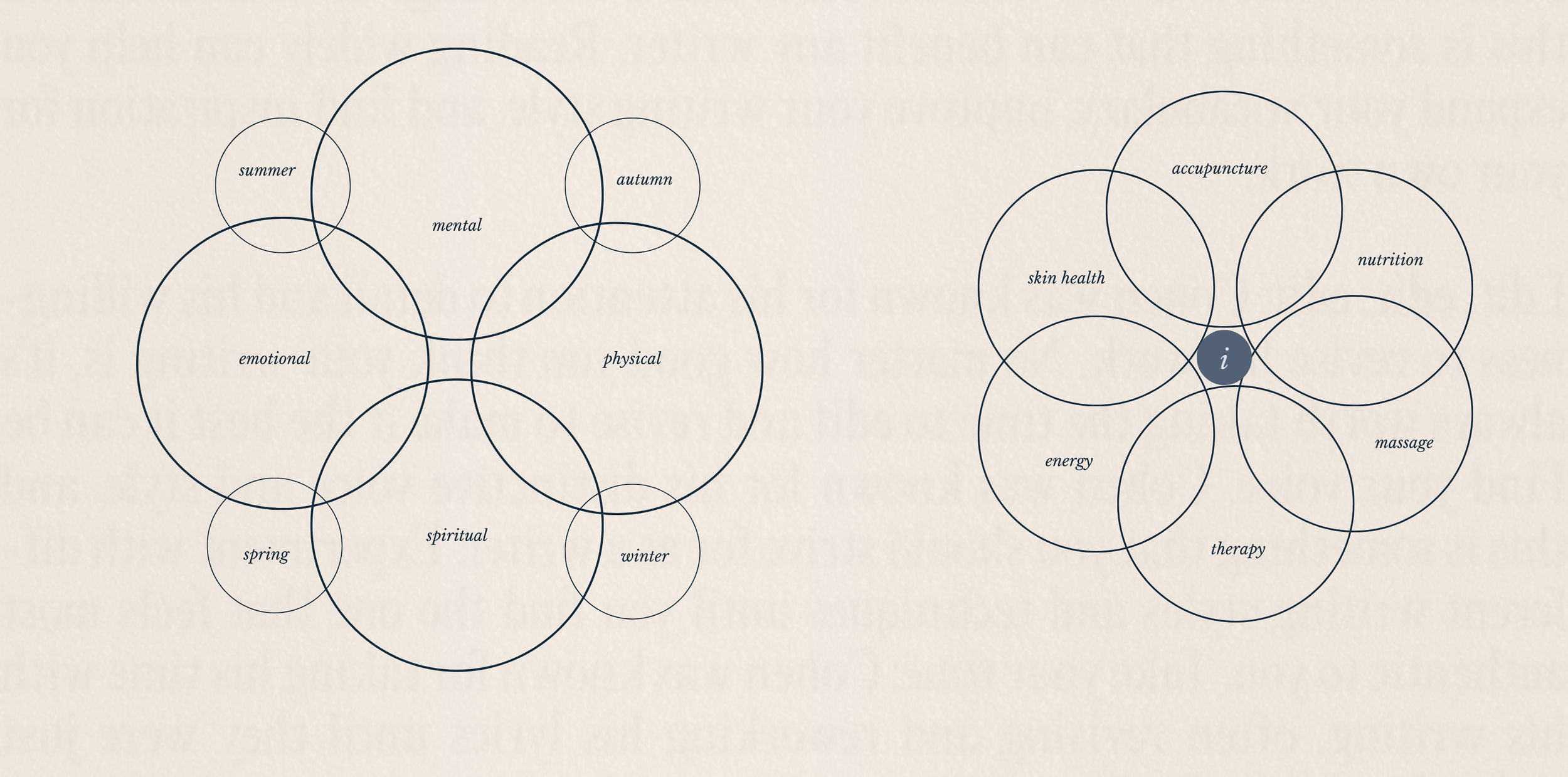
In terms of shapes, straight edges convey masculinity, while rounded edges suggest femininity. Typography plays a role too: uppercase letters are typically seen as masculine, and lowercase as feminine. But (and if you look at the words in figure 0.ii) even when all in lowercase, the normal type becomes the masculine, the italic the feminine. (further shown in figure 0.ii———a further deconstruction)
Color palettes, while more obvious, further this concept, with darker shades representing masculine energy and lighter hues embodying the feminine. This has nothing to do with gender, more so the feeling, the energy you get from observing it. The merging of these elements—even with just words—becomes an unspoken element in the feeling of the design.
But it's not about a 50/50 balance (that actually would result in quite a lackluster impact). It's about how these elements offset and complement each other in a brand's suite of assets. This harmonious interplay creates a dynamic and nuanced aesthetic. I'll delve deeper into this concept later in this journal, showcasing how it shaped Indigo's overall evolution. First, let's explore the initial words that marked the cornerstone of what I aimed to create for Indigo (figure 0.ii———a further deconstruction).

figure 0.ii——masculine meets feminine

figure 0.ii———a further deconstruction
open-door development: a transparent look at indigo's progress
In the realm of business, alignment signifies the harmonious integration of personal and professional values. This synergy is especially crucial in founder-led ventures like Indigo, spearheaded by Carolyn and Sarah, and in choosing collaborators who resonate with these core principles. A fundamental belief shared by both Indigo and the Samantha Wills Institute is the absence of gatekeeping, promoting openness and accessibility.
This philosophy underpins our desire to not just unveil Indigo's brand evolution, but to delve into the meticulous thought process behind it. We aim to offer more than just an interesting narrative; our goal is to provide insights that could be valuable in your own business development, regardless of the industry.
Below is an early document crafted during the preliminary phase of Indigo's evolution, a testament to our commitment to transparent and insightful business growth.
i.to evolve the brand——identity
In the brand work I do and in my own ventures’, I see brands as beings, they have heartbetas and pulses, personalities and quirks, our job as creatives, creative founder and brand builders is to hone our brands personification to allow people to connect. Business is what we do, the logistical, financial, framework of the what, the brand is the emotive, personality, connection of the why. And just like humans, as a child grows from a toddling beginner into a mature adult, a brand evolves from its startup phase through adolescence to maturity, necessitating a transformation in identity, strategy, and expression.
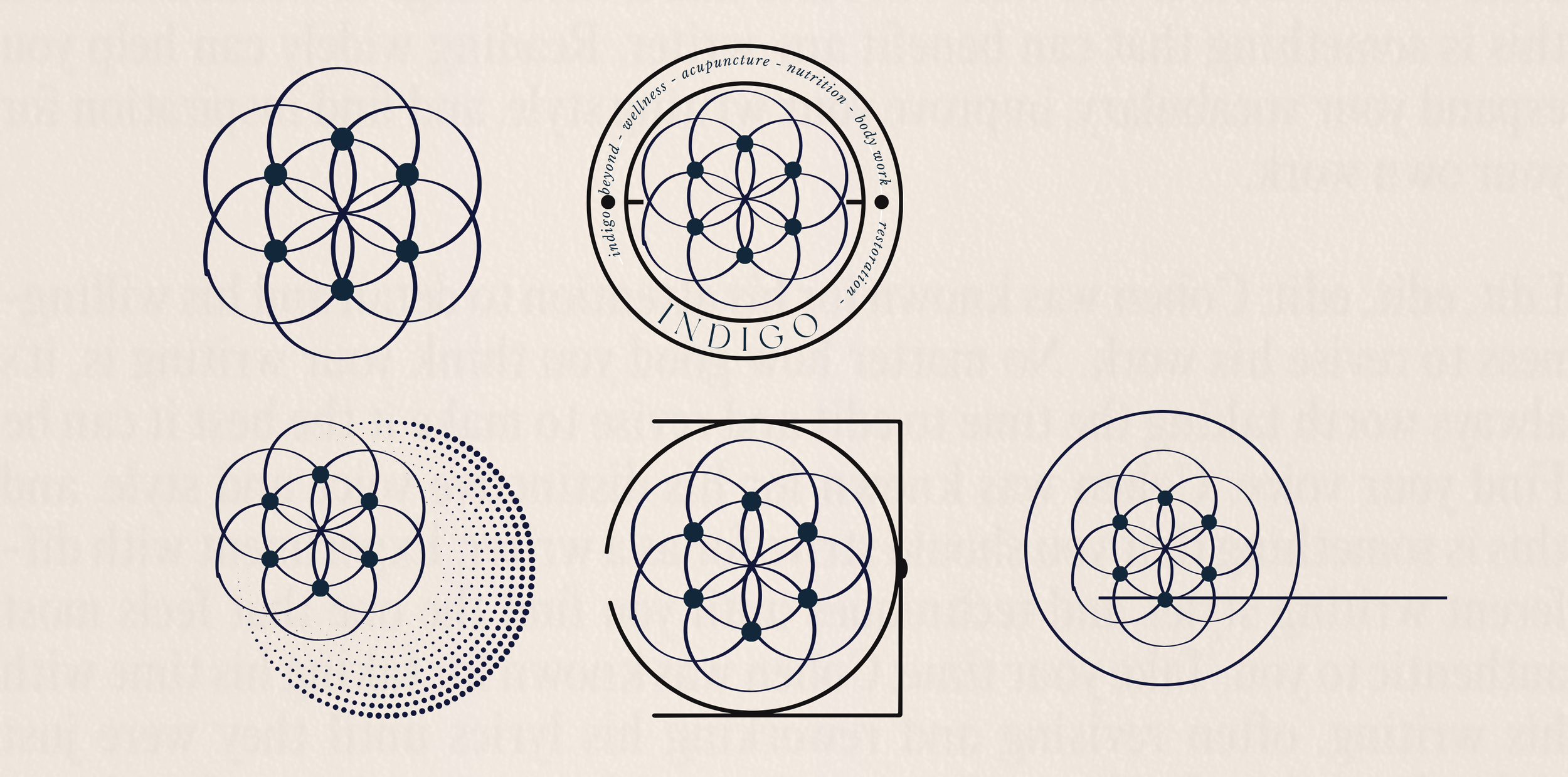
insignia + ethos
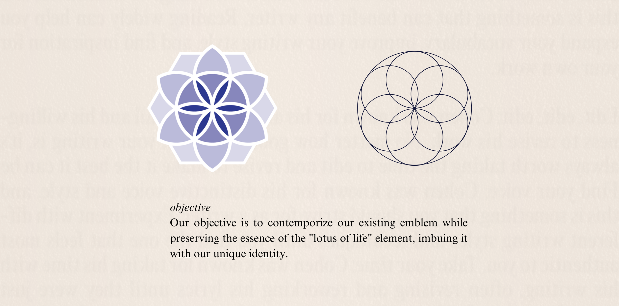
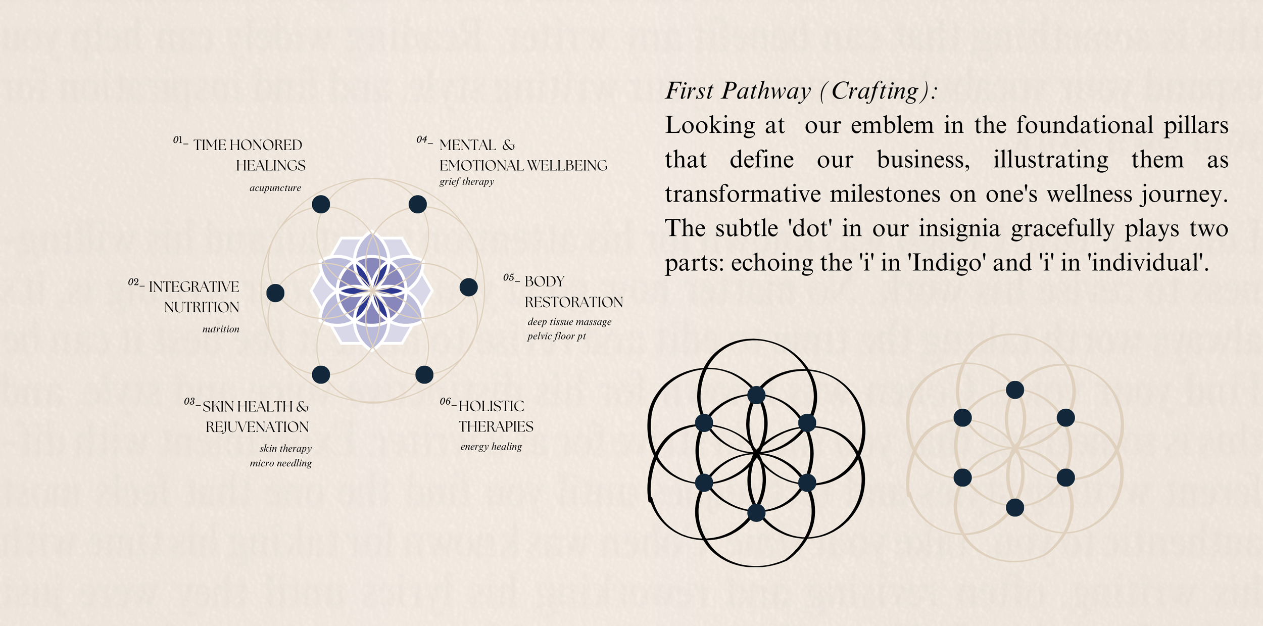
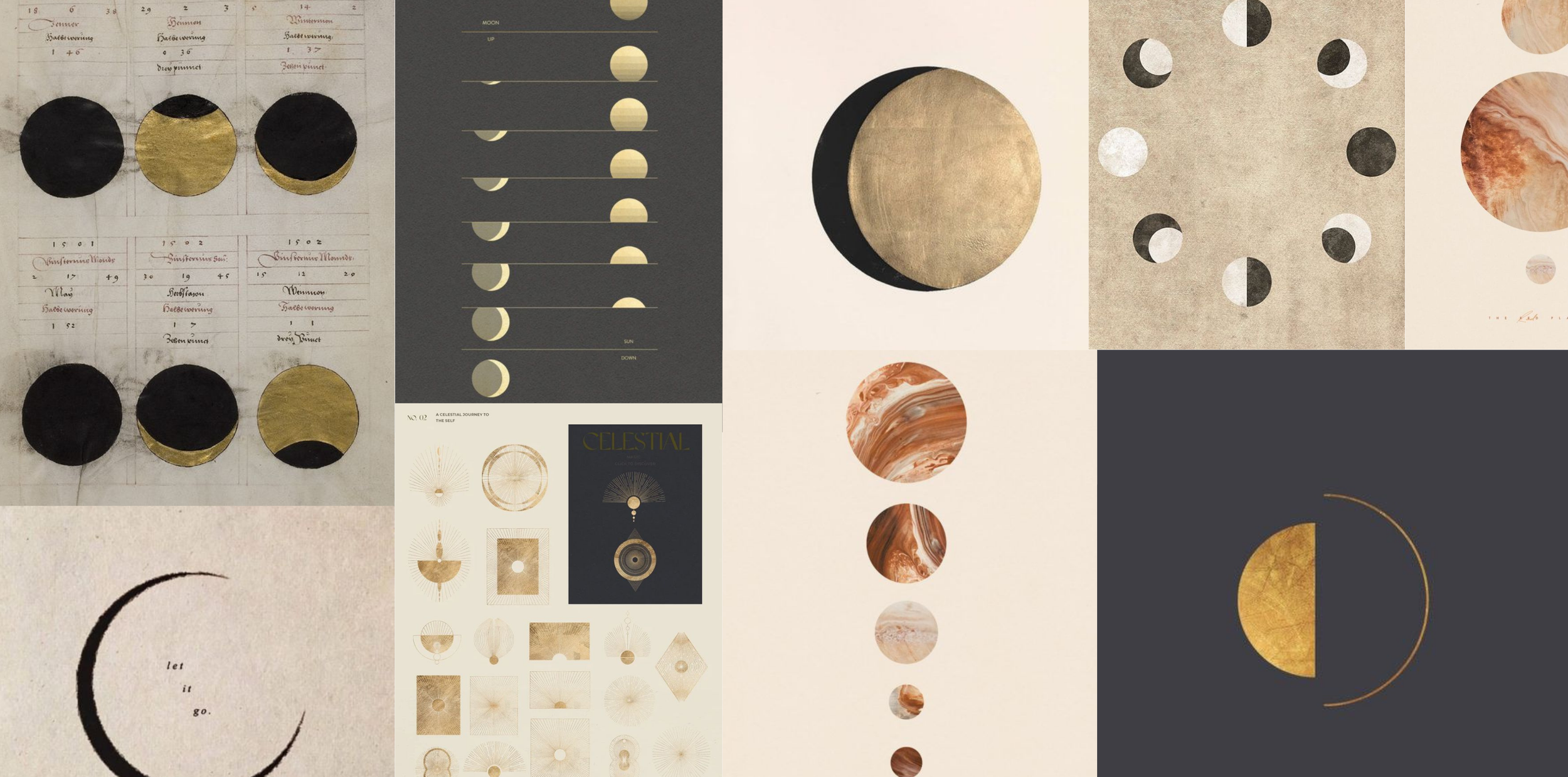
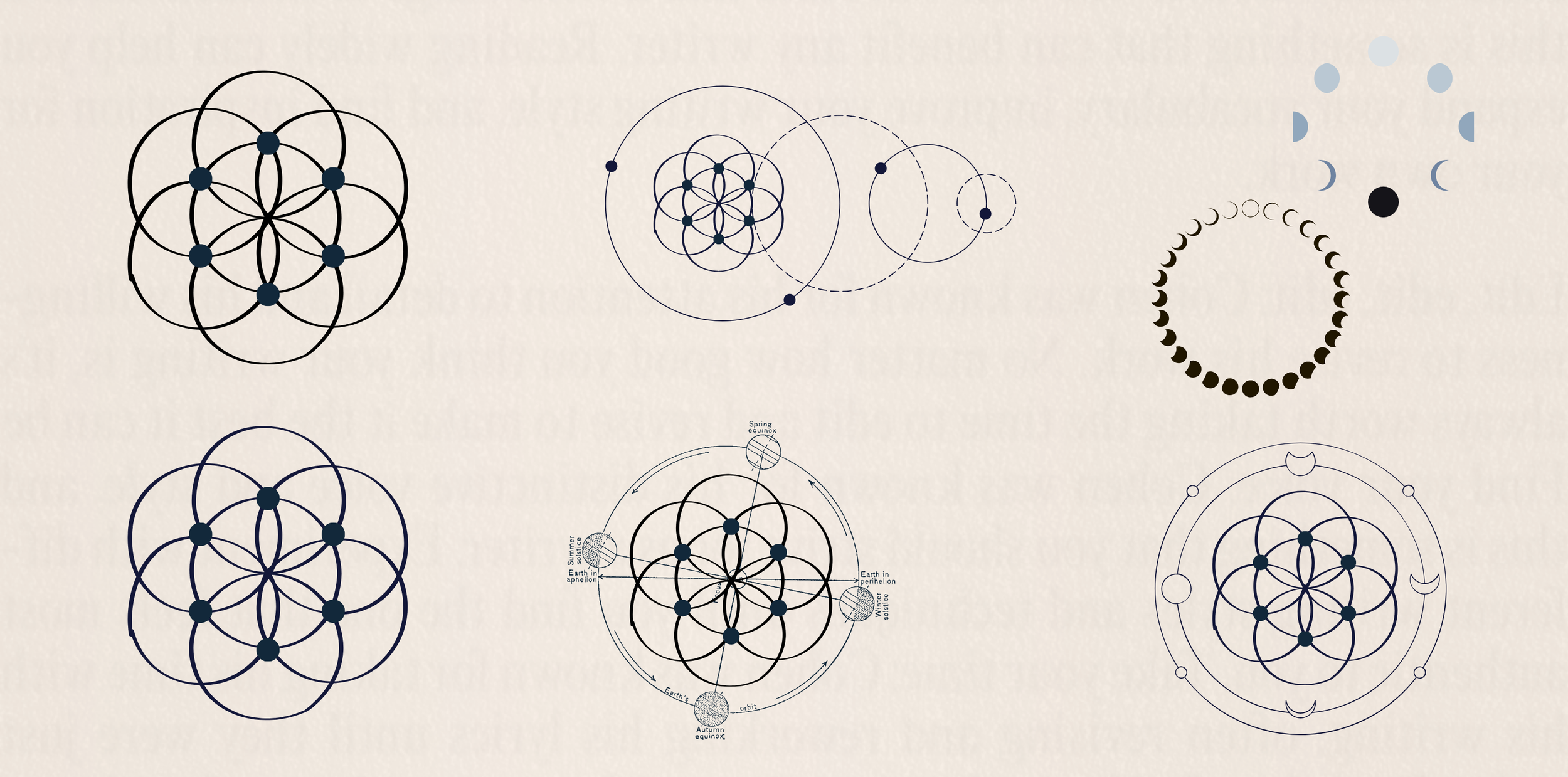
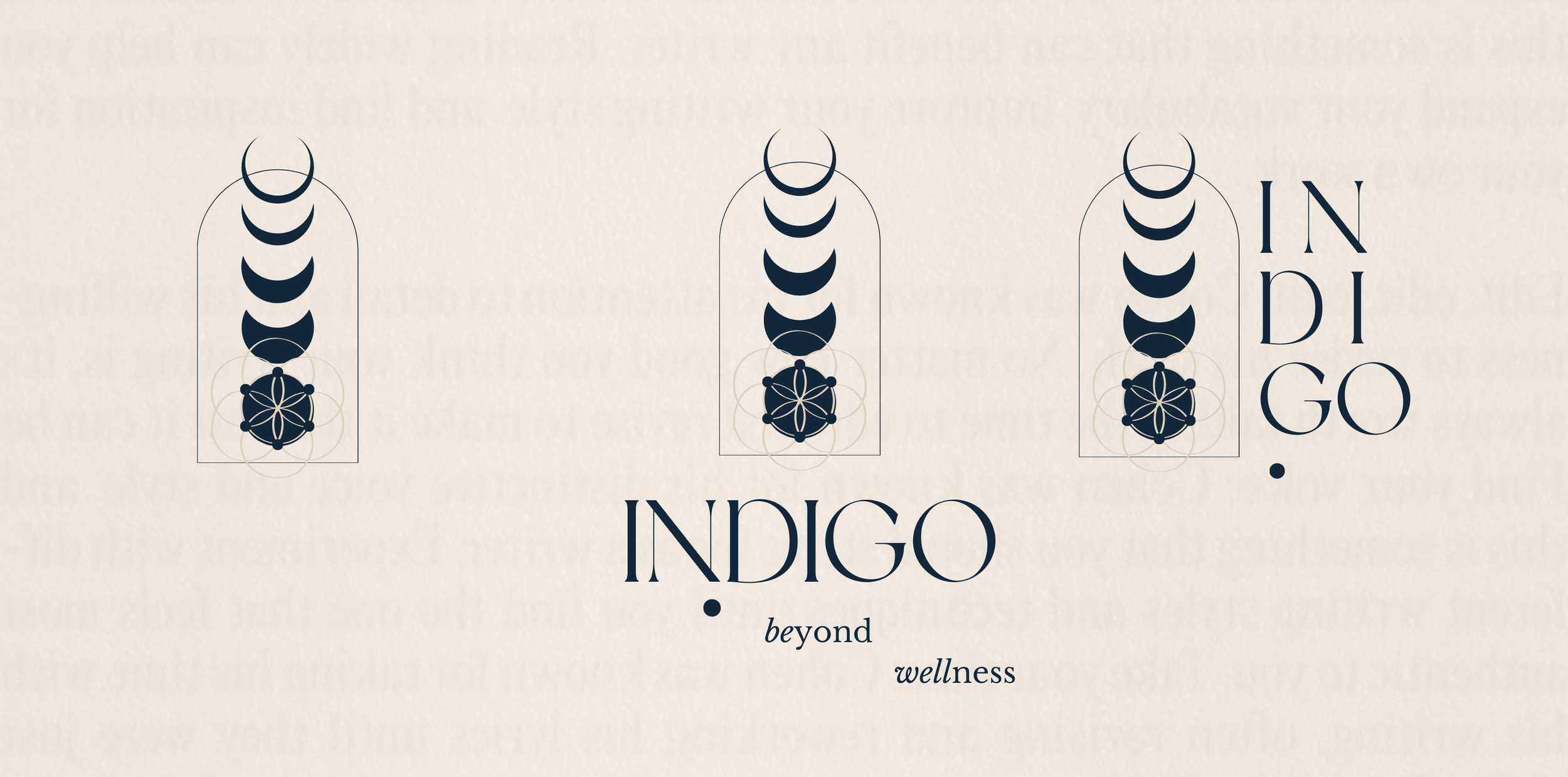
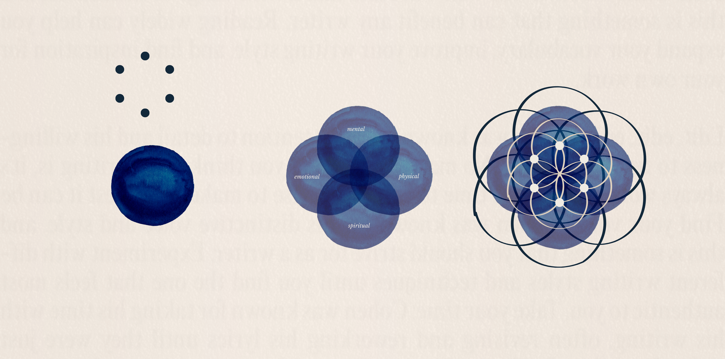
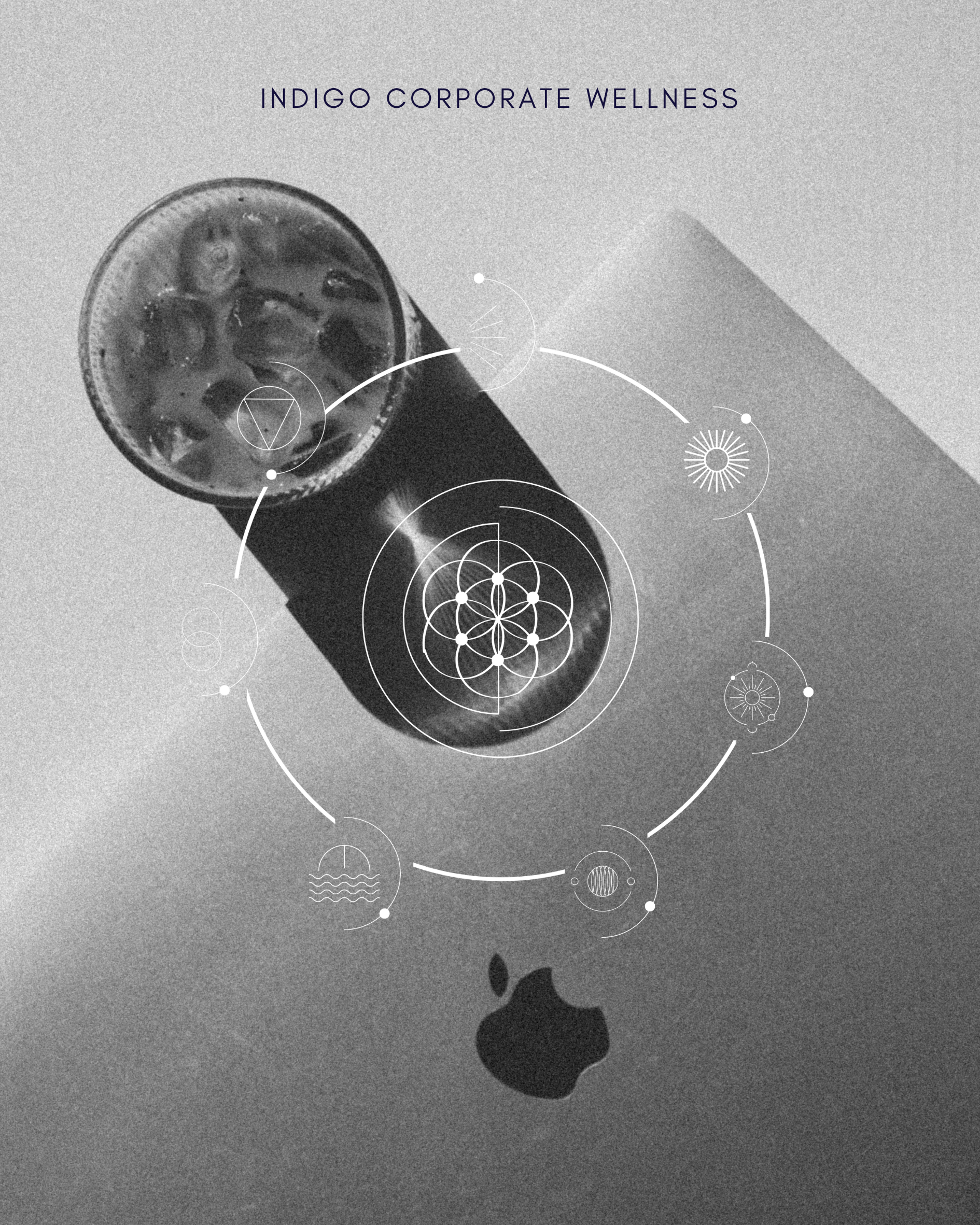
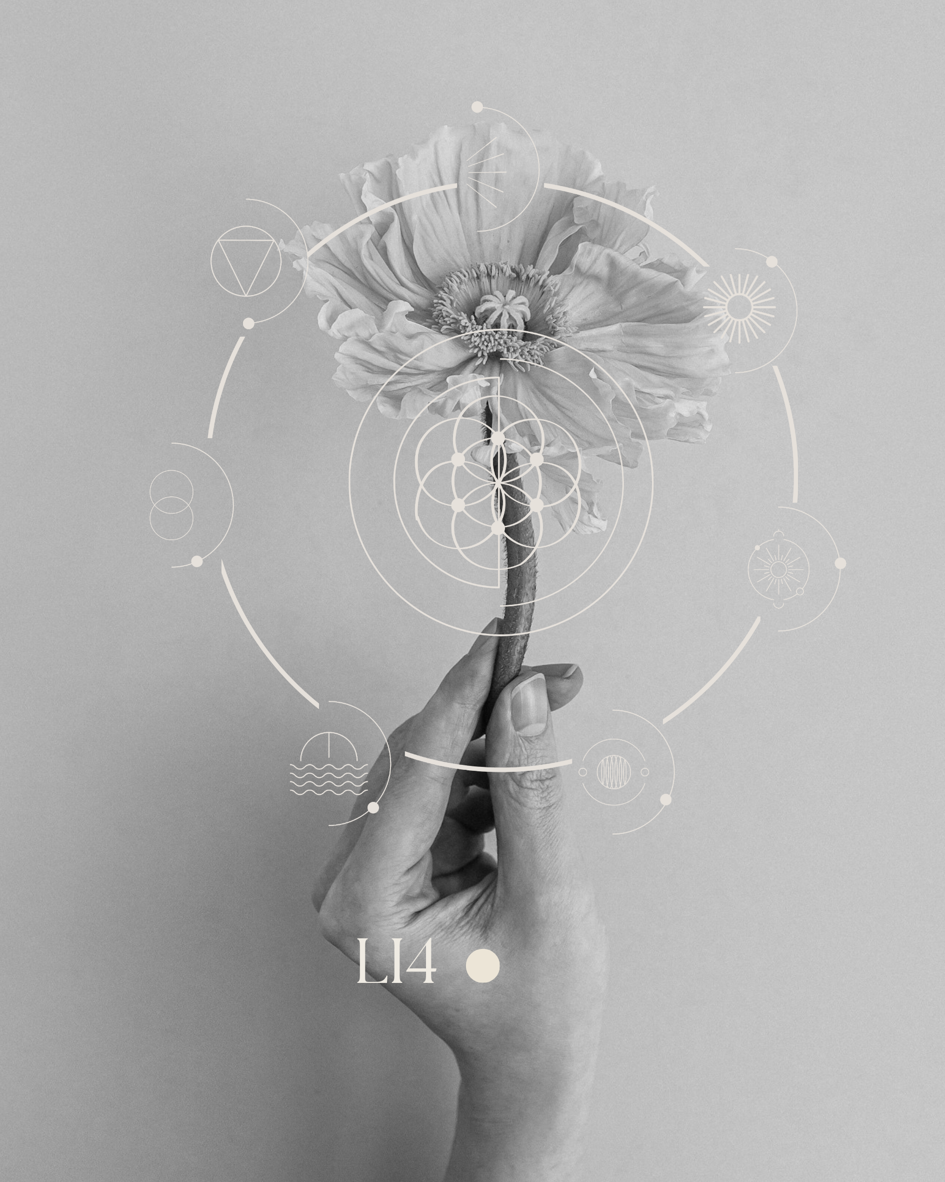
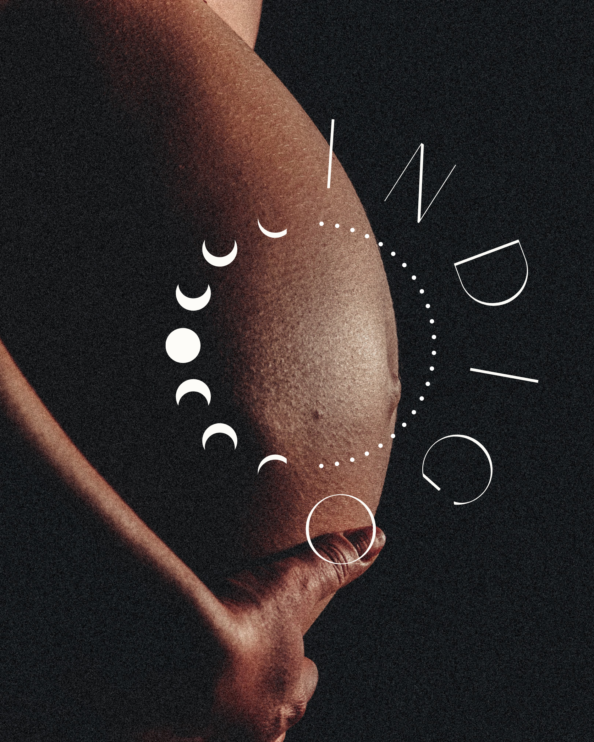
The original insignia, embodying the 'lotus of life,' remains central in our evolution. We've refined the sacred geometry, introducing intricacy and removing the solid fill to embrace subtlety. The crescent shapes pay homage to the lunar influence on our well-being, particularly in women's health, while the added dots at each intersection symbolize both Indigo's array of services and the individual's journey, illustrating how holistic wellness culminates in a complete being. (figure i.i: origins——evolution)

figure i.i: origins——evolution
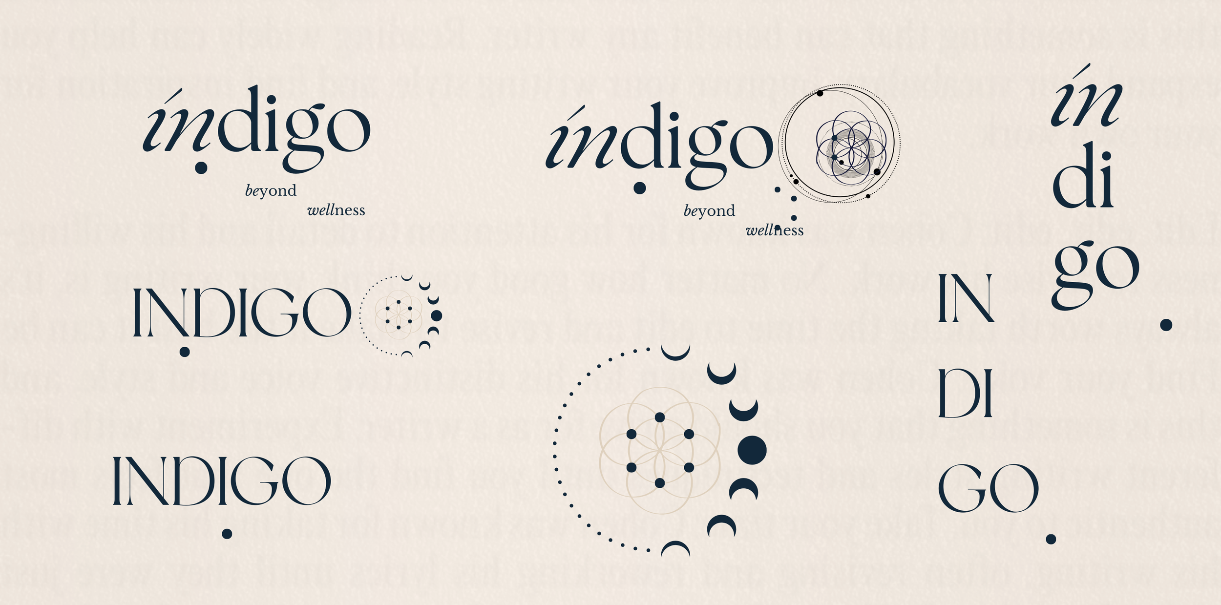
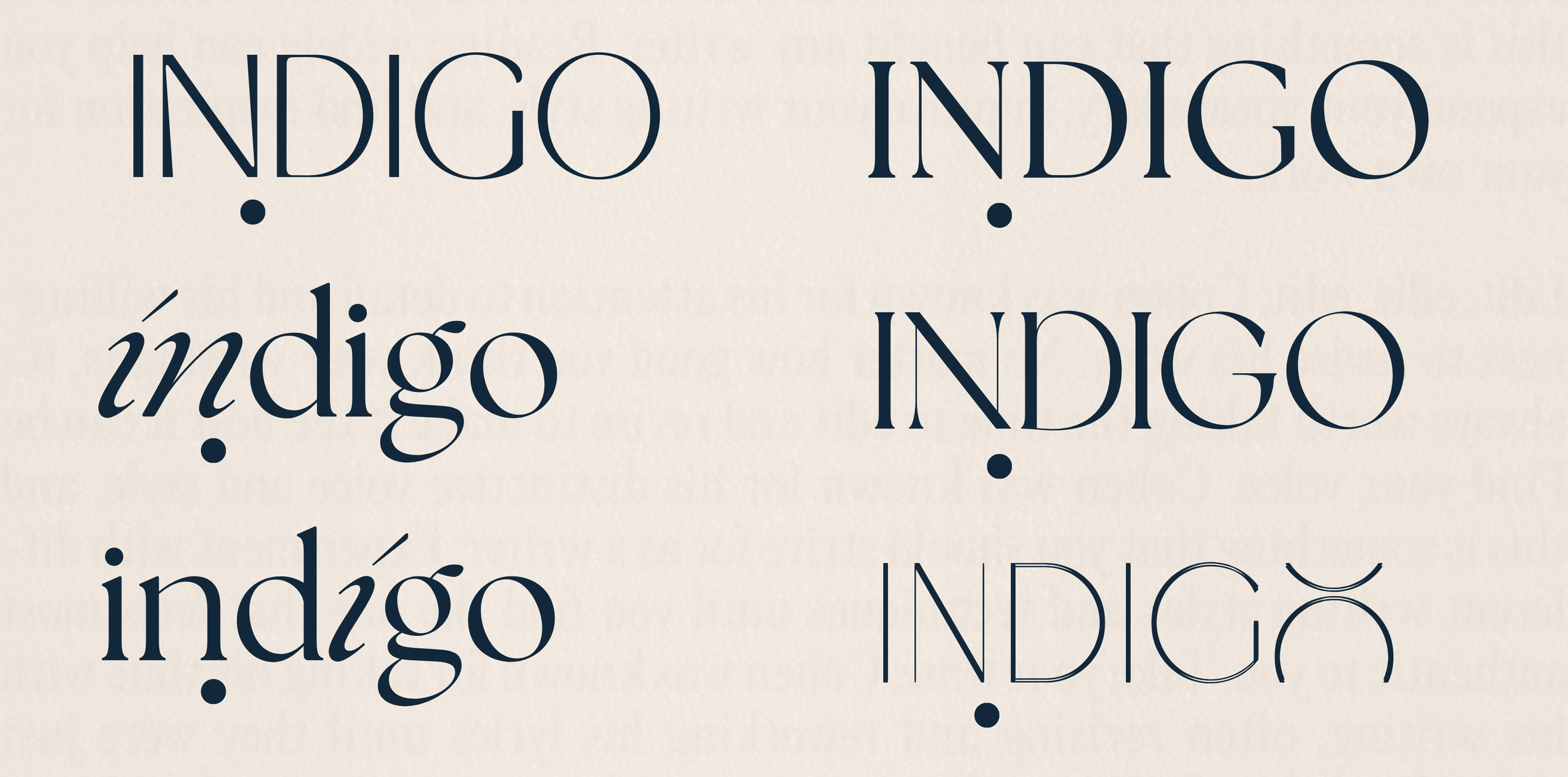
logo + tagline
A way to visually depict a brand's maturity is often to see the logo go from containing lowercase to evolve to uppercase, uppercase represents authority and maturity. As the original identity was already uppercase, we developed a wordmark that remained uppercase, but with a little twist at the end, with the 'O' reminiscent of a symbol from the alchemic chart. (figure i.ii: origins——evolution)

figure i.ii: origins——evolution
business meets brand——the eagle and the field mouse
In business, I often refer to what I call "the eagle and the field mouse" concept. This practice applies to all areas of business and leadership, and is particularly relevant when it comes to brand evolution, which I'll describe here. The eagle represents a broad perspective—she soars high, gaining a comprehensive view, focusing on the big picture, and strategizing for the future. It's about foresight and structuring today for tomorrow's gains. The field mouse, in contrast, has a ground-level view, acutely aware of the minutiae—the texture, shape, and hue of the grass blade right in front of her.
When evaluating a brand, I adopt both the eagle's expansive vision and the field mouse's meticulous attention to detail. For instance on this project, I recommended moving 'Wellness Group' to our corporate vernacular, defining the company more broadly to encompass potential new divisions beyond our physical clinics. While those implementations aren’t happening today, the stricture is now there for when they do. That's the eagle's outlook.
Zooming in, like the field mouse, we crafted a new tagline that captures our essence: "Beyond Wellness." It reflects Indigos integrative approach, it is anything but singular, it goes beyond; catering from skin to soul. It's more than a slogan; it's also our true wish for every client—to be well, in every sense.
insight into the premliminary phases———below is an early presentation deck I crafted for Sarah and Carolyn, offering a glimpse into the initial aesthetic vision for the rebrand. While visual communication might seem self-evident in a rebranding process, I believe in the importance of thorough communication at this stage. By presenting various iterations and rough layouts, akin to a creative brainstorming session, my aim is not to overwhelm but to guide. As the creative lead, I highlight the most compelling concepts, setting a direction while still offering the client a range of options to refine their vision. This approach provides a clear starting point and invites clients to identify even subtle preferences in imagery or style. It's a collaborative process, ensuring that the client's feedback is integral, aligning everyone's vision as we transition to the next development phase.
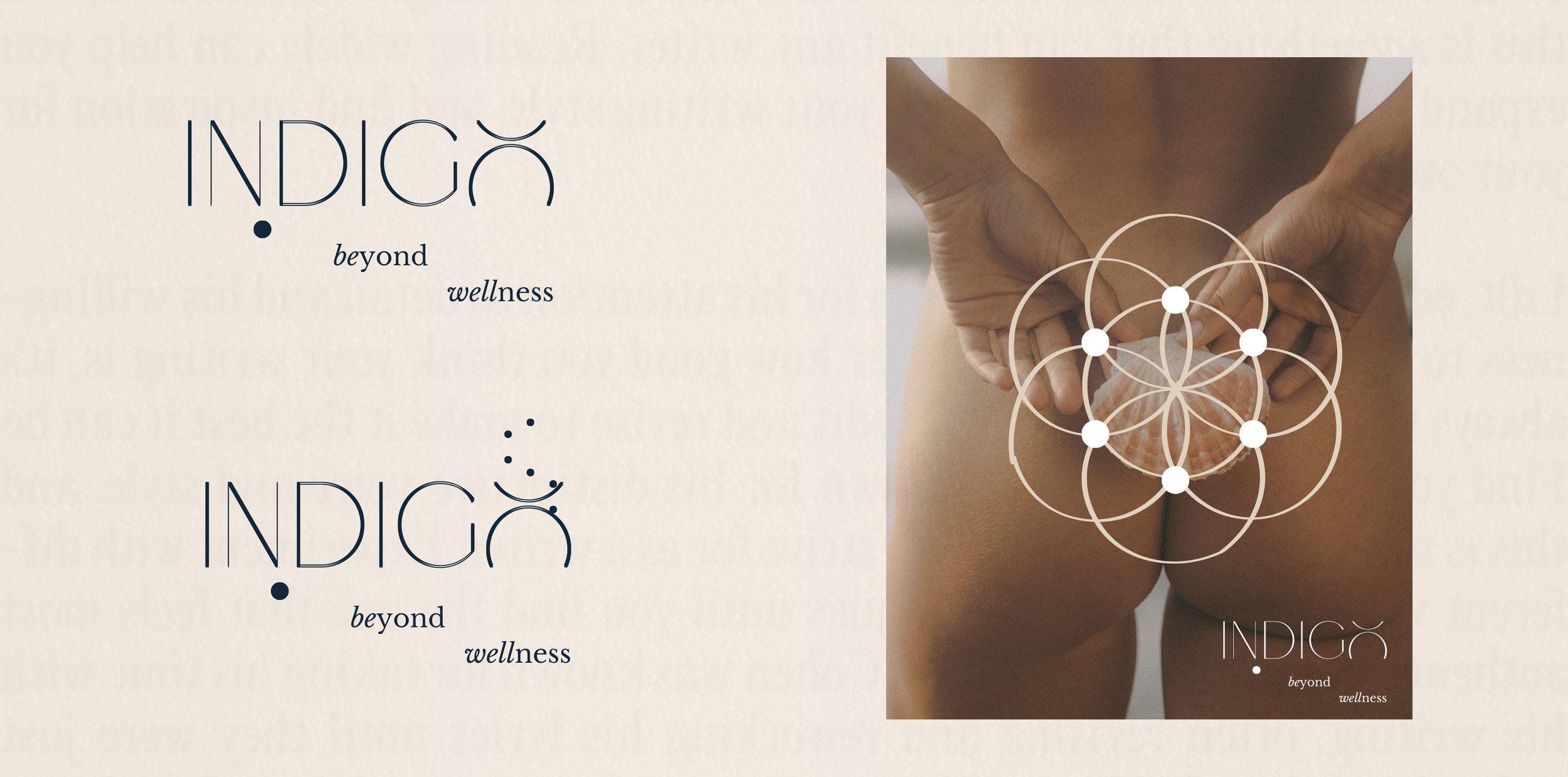
submarks
I knew that the brand evolution would not only be artwork heavy, but from the busines perspective I understood Carolyn and Sarahs desire to expand in product and divisional offering, which mean that we would need cohesive submarks to apply across different brand assets and commnuicnations. (figure i.iii———identity + submarks)

figure i.iii———identity + submarks
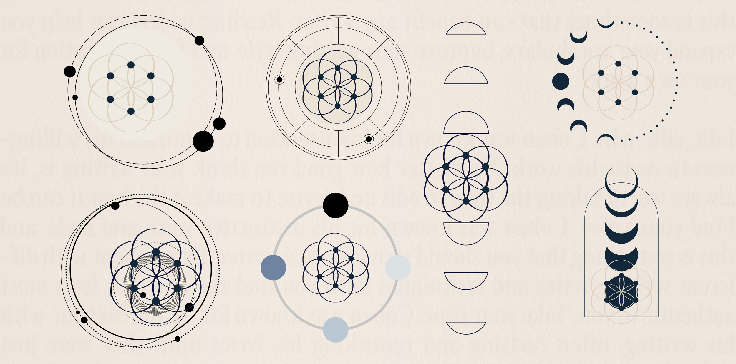
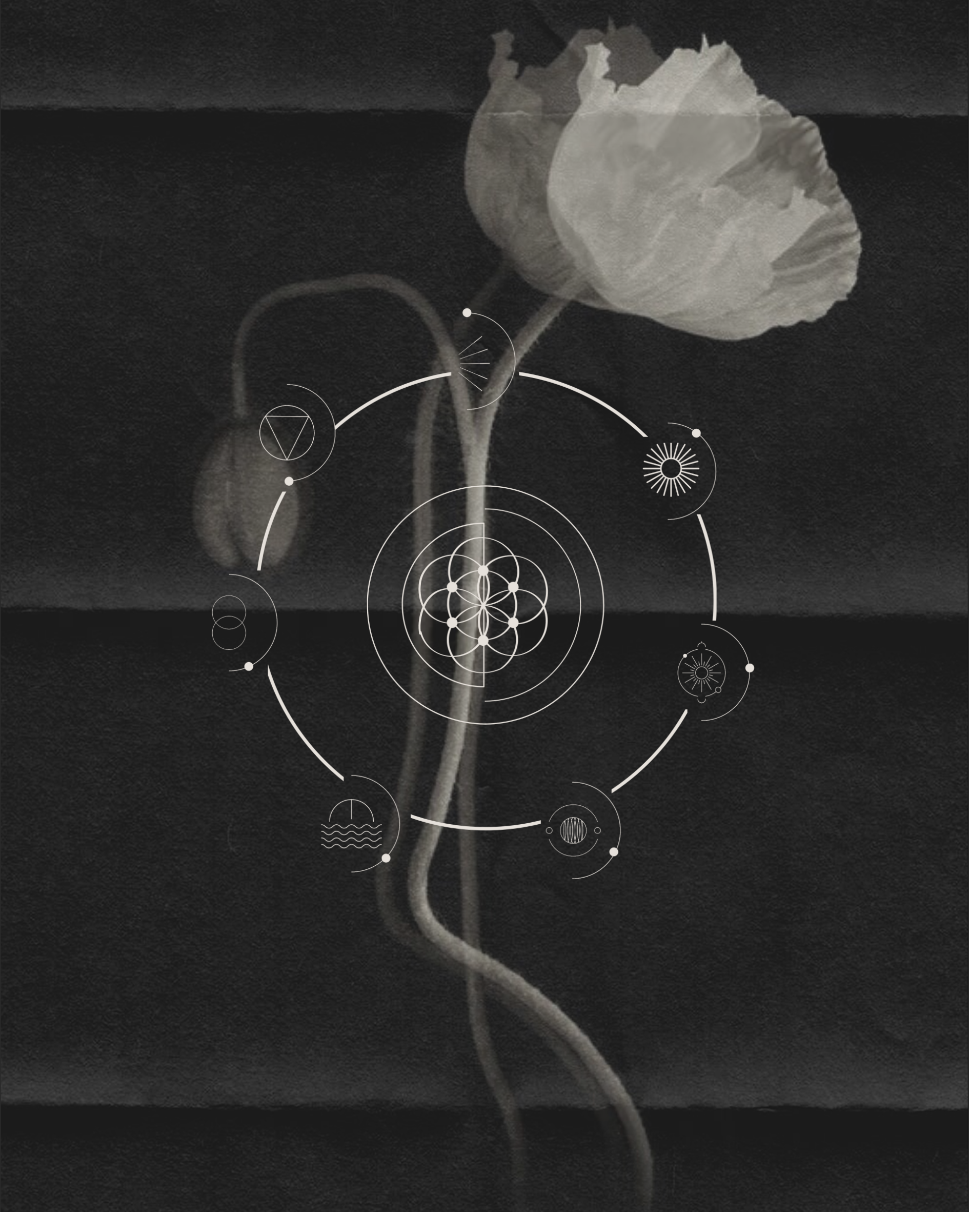
iconography
In this final stage of development, I focused on creating iconography (figure i.iv———iconography) to represent each service division of Indigo. Drawing inspiration from alchemical charts and celestial symbols, I aimed to infuse a scientifically grounded essence into the designs. The icons possess a clean, masculine, and purposeful construction, complementing the softer, more feminine imagery like beautiful florals.
A subtle detail I incorporated was the half-moon crest border with an Indigo dot, symbolizing the moon's orbit around the earth. This reflects the diverse elements Indigo offers, which together form a holistic health balance.

figure i.iv———iconography
graphic development
Alongside the submarks, I further developed these icons into a unique graphic (figure i.v———iconography as graphic), inspired by solar cartography. These icons encircle the core brand insignia, anchoring it within a universe of Indigo's services and ethos.

figure i.v———iconography as graphic
ii.a feeling of cosy and calm——palette
palette & texture
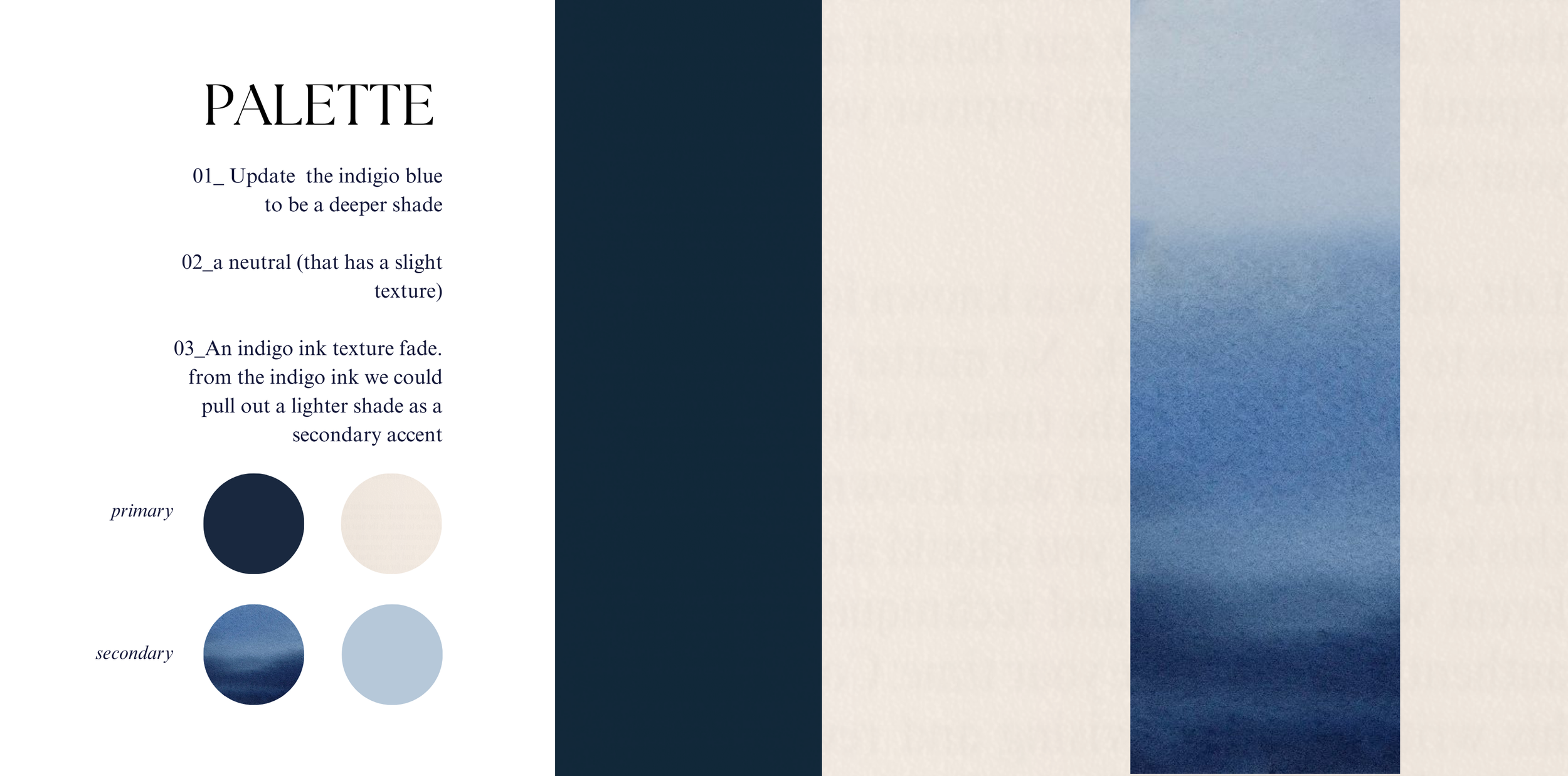
If you’ve visited the Indigo clinics, you'll know the dark navy walls create an instant sense of calm and coziness. Sarah and Carolyn aimed to replicate this feeling in their brand and digital experience, focusing primarily on palette and secondarily on texture.
Below, you’ll see the deepened new palette (figure ii.i———-palette evolution), still paying homage to its roots. In branding updates, there’s often a temptation for a complete overhaul, which can excite those working on the brand but confuse consumers. Therefore, it’s crucial, especially with the palette, to maintain brand recognition. (While changing brand colors entirely is of course possible, it should be a gradual shift, gently introducing new hues and phasing out old ones to make the transition almost imperceptible.)
For the Indigo evolution, we chose to move away from the pastel tones and anchor thing by reflecting nature in our main palette, grounding it in earthy and oceanic tones, by deepening the original core colors.
Texture also plays a significant role in grounding the brand’s essence, an aspect I’ll delve into more soon.

figure ii.i———-palette evolution
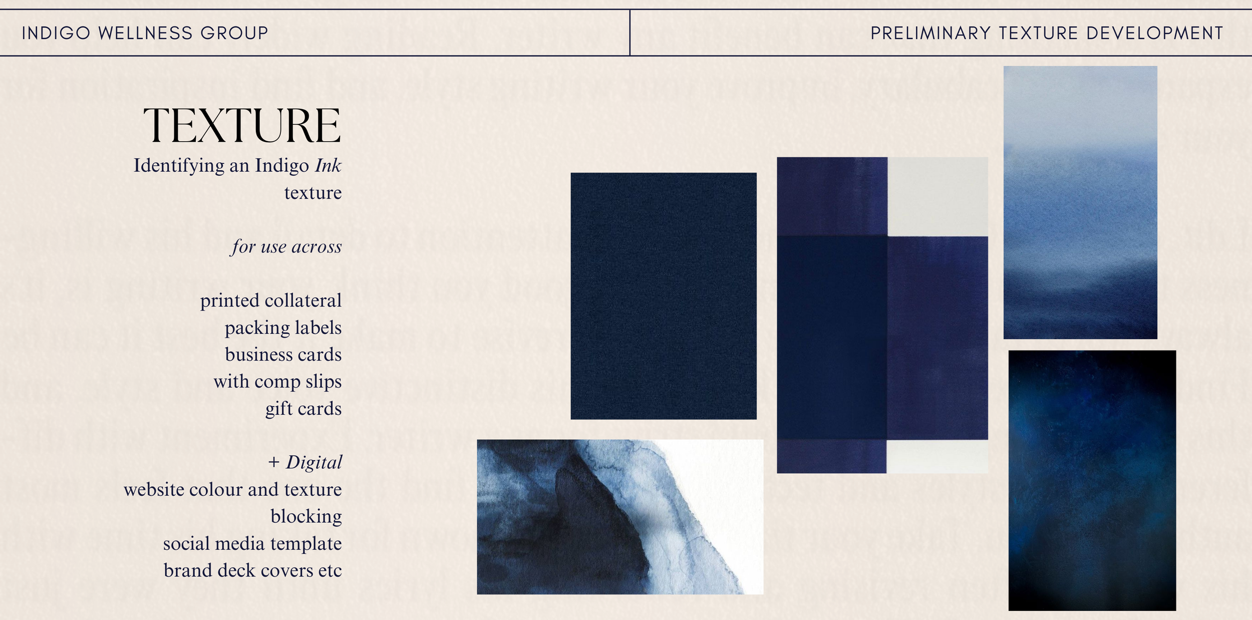
indigo ink
I added a texture very early in this process and we would go trhouha few iterations of what we finally ended up on, but the principle objective was to find something that would become the ‘indigo ink’.
tactility
I envisioned the brand possessing a tactile quality, as if you could sense its texture without physically touching it. Achieving this involved not just the use of gradients but also the choice of materials, like textured card, to enhance this sensory experience.
femininity & ink
The hand-drawn quality of ink brings a soft, fluid femininity to the design, contrasting with more structured, masculine elements. Ink, especially when mixed with water, defies straight lines—a natural law—thus, it inherently embodies a feminine characteristic.
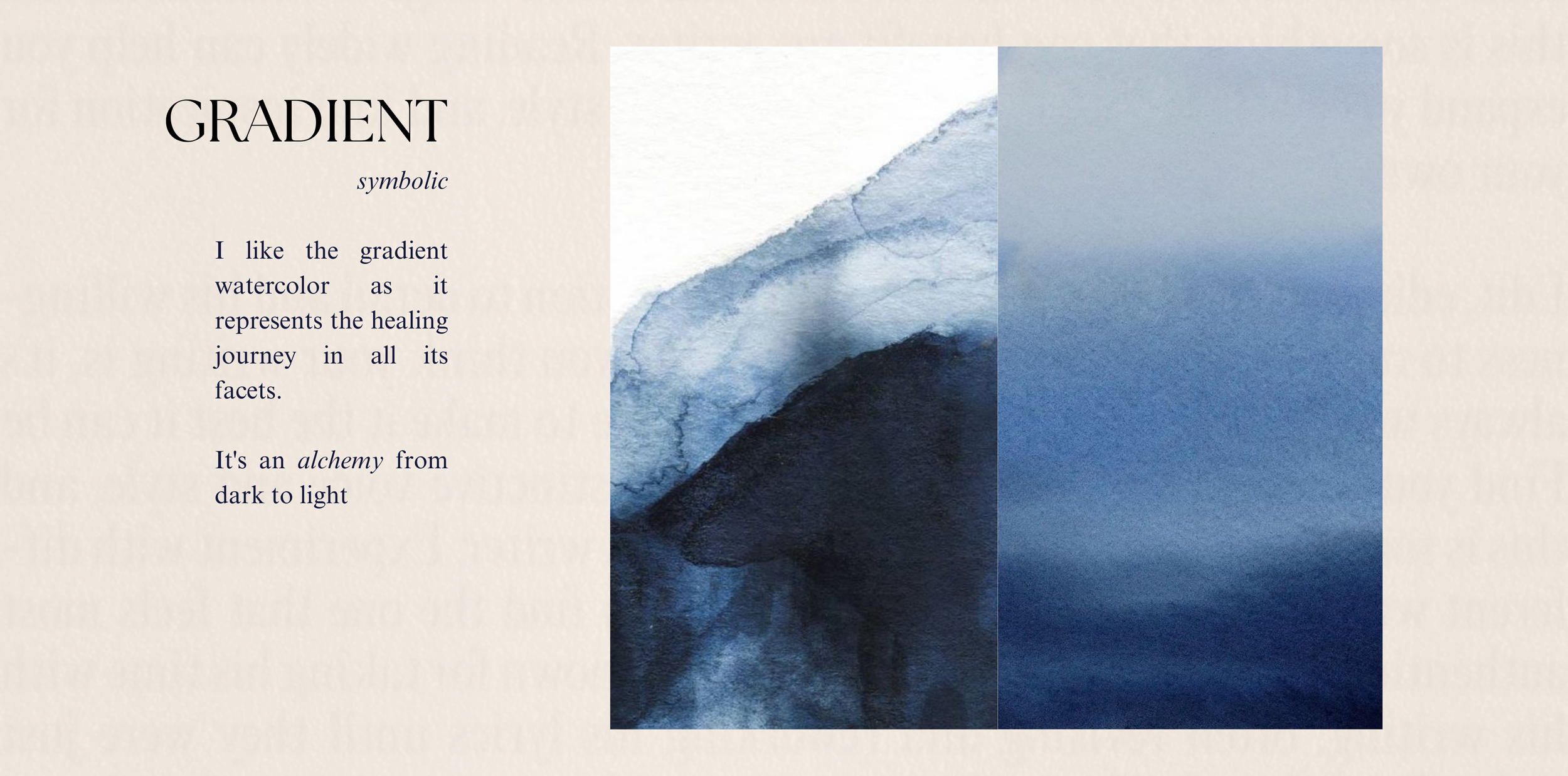
alchemy in design
The transformative work at Indigo is akin to alchemy, turning darkness into light, whether through massage, energy work, or any wellness approach. We wanted the design to reflect this beautiful fusion of yin and yang, light and dark, capturing the essence of Indigo’s transformative power.
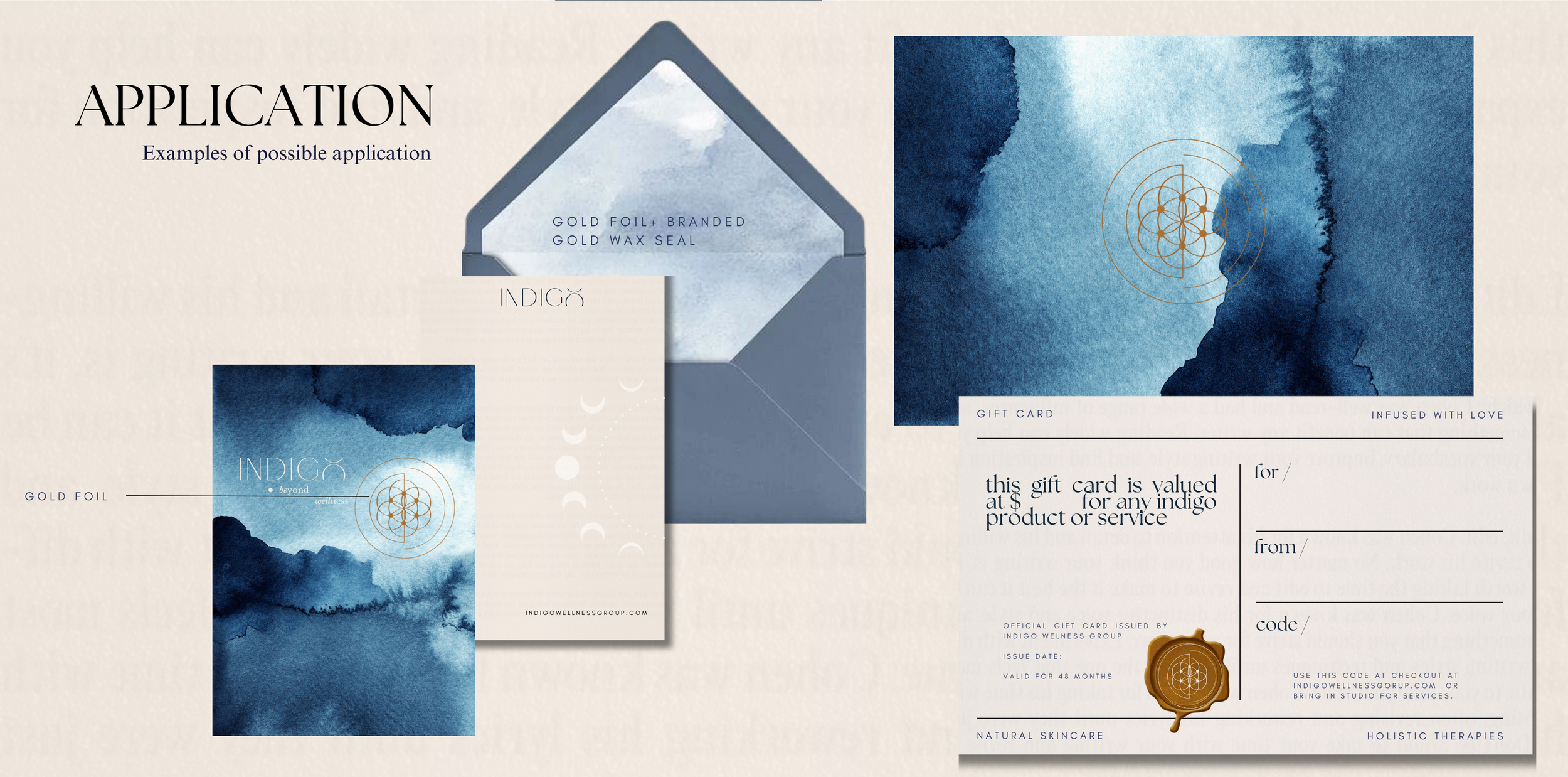
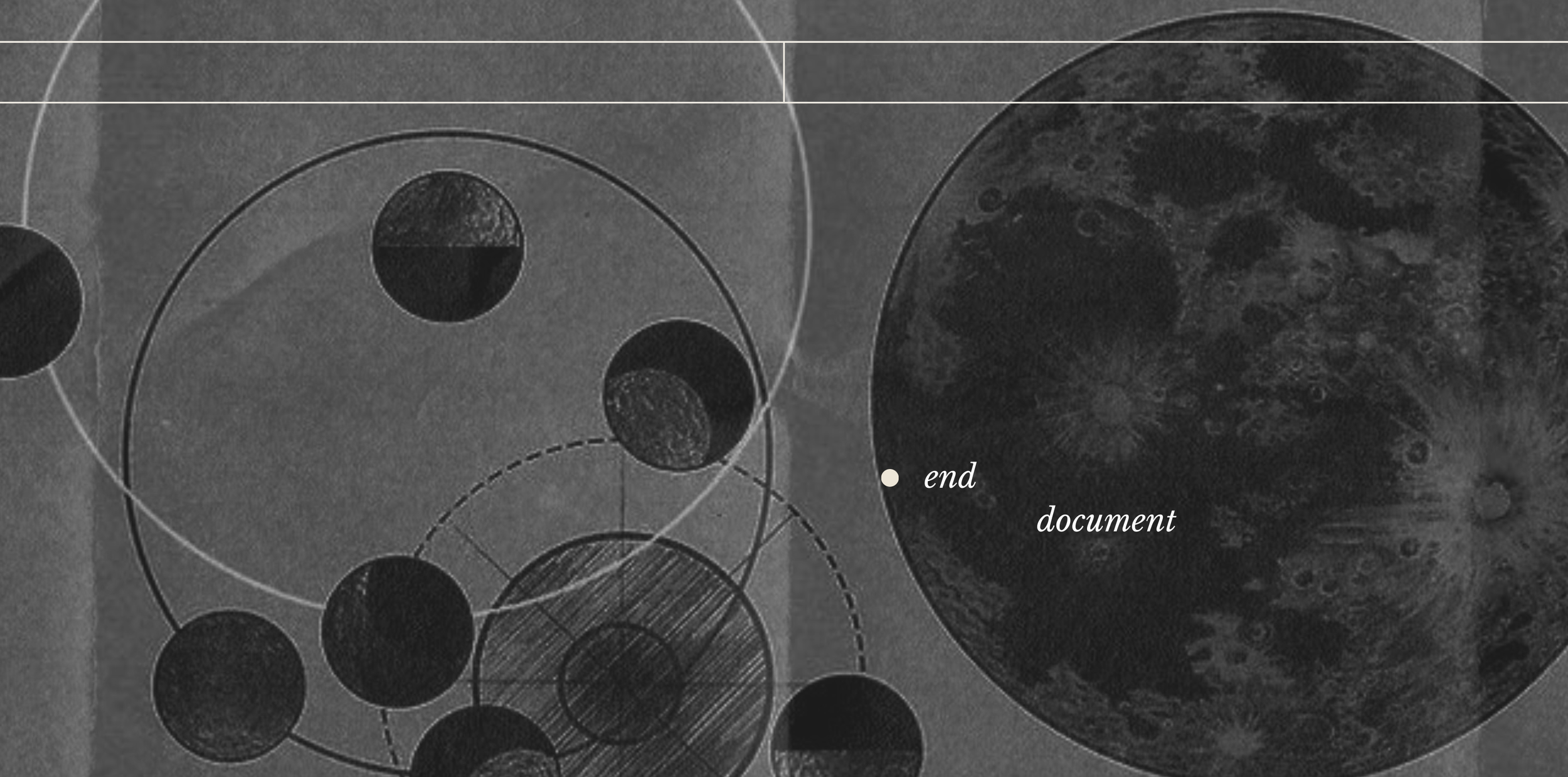
beginning and end: portals
One of my core focuses in branding in this digital age is how do you go beyond the screen? A prime example of that is how can you turn an email sign into a mail-delivered note? Another way to explain the thought realm here is how do you give your audience an experience that transports them, even if momentarily, they forget they are on a website looking at a digital screen, rather they are transported into your branded world, they want to explore more, peek around corners and follow winding staircases to see where they lead?
That is the portal and it's up to us to provide where that is for our branded world. We created that portal with this texture.
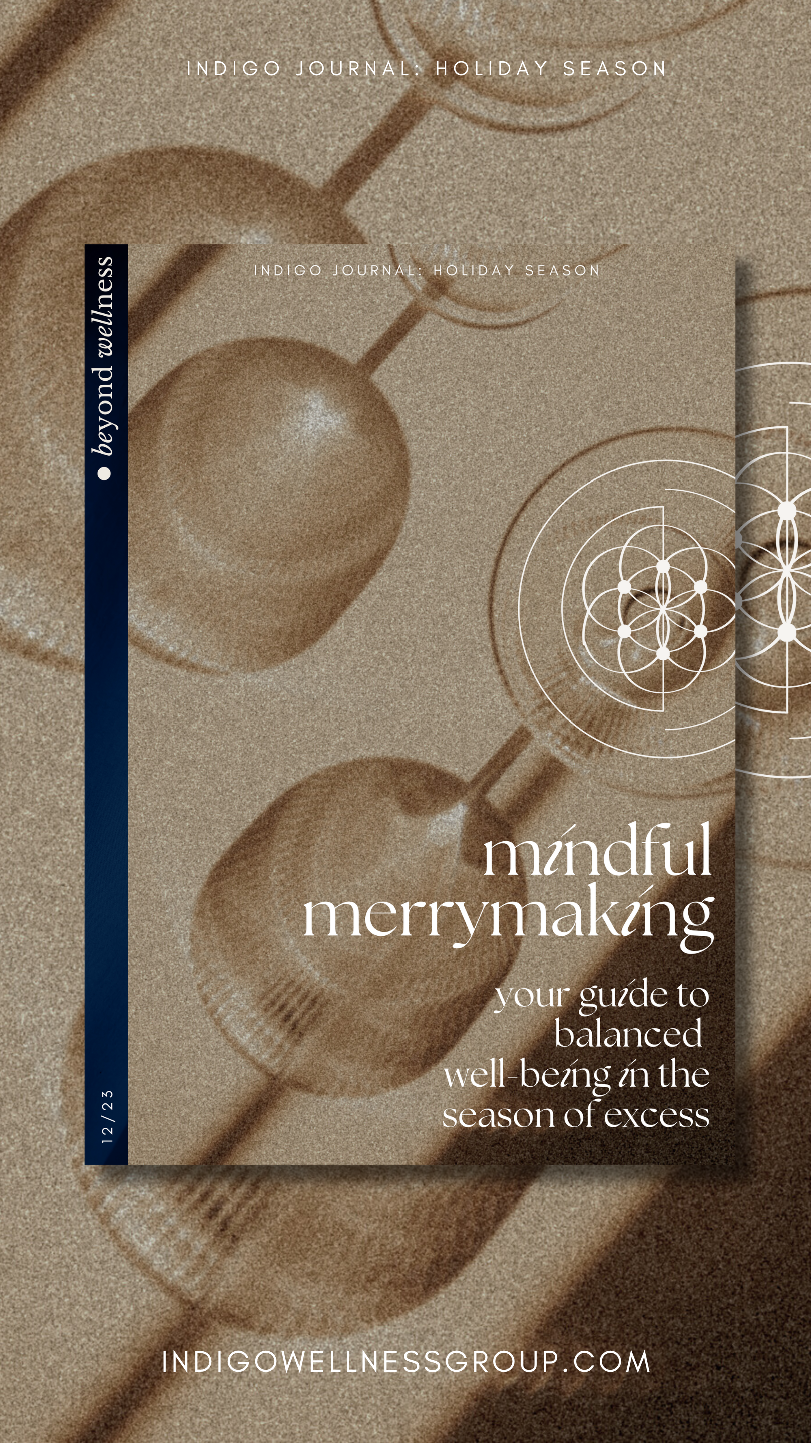
Pictured is the texture we decided on (figure ii.ii———-indigo ink), with an additional element I applied to a lot of the imagery of a folded paper treatment + how it is used on the home page(figure ii.iv———-indigo ink with alchemy movement) as the first point of entry to the world of Indigo, to bring this further to life I added a small fluid movement to it representing the ever-present process and cycle of alchemy, and it is also placed site-wide on our footer and booking page as the exit portal back to the real world.

figure ii.ii———-indigo ink

figure ii.ii———-indigo ink with paper treatment
figure ii.iv———-indigo ink with alchemy movement
iii.fresh and holistic——
The third objective centered on creating a modern yet inviting presentation for our holistic services. The aim was to strike a perfect balance—neither too sparse nor overly elaborate—ensuring a harmonious blend of aesthetic appeal and clarity.
visuals
My vision was to craft imagery that makes our website and Instagram feel like an enchanting, holistic art gallery. A space where visitors are drawn to linger, return, explore what's new, and appreciate what's familiar.
In branding, if something captivates people, they're inclined to revisit. Think of our business as the souvenir shop at the end of an exquisite journey—when you experience something extraordinary, you naturally want to take a piece of it home.
This foundational approach guided this phase of the project.
words to art
With a focus on the holistic beauty of Indigo's offerings, I delved into the etymology of our service descriptions. The goal was to transform these words—through a process akin to alchemy—into visual representations, creating a beautiful and meaningful connection between our services and their artistic expression.
WHAT WOULD THESE LOOK LIKE AS ART?sage. healing. alchemy. serenity. harmony. tranquility. rejuvenation. nirvana. elixir. zen. oasis. chakra. bliss. euphoria. mystic. aura. enlightenment. balance. vitality. renewal.
Clary (from Sage): Referring to the clear, bright quality of sage. Therapeia (from Healing): Ancient Greek for 'attendance', 'service', 'cure'. Chemeia (from Alchemy): Rooted in the Greek term for 'art of metalworking'. Idyllic (from Serenity): Representing peaceful, picturesque scenery. Concord (from Harmony): Denotes agreement and peacefulness. Repose (from Tranquility): A state of rest or relaxation. Revivify (from Rejuvenation): To give new life or vigor. Nirvanic (from Nirvana): Reflecting a state of perfect happiness. Panacea (from Elixir): A solution or remedy for all difficulties. Satori (from Zen): Sudden enlightenment in Zen Buddhism. Sanctuary (from Oasis): A place of refuge or safety. Vortex (from Chakra): Whirling energy, related to the spinning energy centers. Beatific (from Bliss): Imparting bliss, blessings, happiness. Rapture (from Euphoria): A feeling of intense pleasure or joy. Arcane (from Mystic): Known or understood by only a few. Luminosity (from Aura): Light, brilliance, or radiance. Bodhi (from Enlightenment): In Buddhism, the understanding possessed by a Buddha. Equilibrium (from Balance): A state of physical balance. Zest (from Vitality): Great enthusiasm and energy. Genesis (from Renewal): The origin or mode of formation.


afterward———-working on this project has been an absolute delight, a true privilege to spotlight the remarkable work sarah, carolyn, and the incredible indigo team do in holistic health and wellbeing.
i hope the transparency of this deep dive into indigo's brand development has been interesting to explore. for those of you building a brand or undergoing a refresh, i hope some of these principles prove helpful.
ultimately, design is an intuitive process; there's no definitive right or wrong. it's all about capturing & communicating the essence and story of the founder(s)' why; i was so fortunate to have the most beautiful ‘why’ to work with on this project.
thank you sarah and carolyn for trusting me with this process.
Samantha Wills founded the Brand Cartography Atelier as brand and creative career consultancy. Clients are taken on through refferal or application only. She also created a signature masterclass program thta has been described as an ‘unparalleled program in creative entrepreneurship’ Samantha Wills Masterclass: The Art of Brand Building. Samantha’s work has been featured by The New York Times, Vogue, Forbes, Harpers Bazaar and The Sydney Morning Herald. She is a sagittarius (if you couldn’t tell).